-
01
The problem the brief hands you
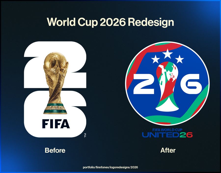
A tournament in one country can lean on that country. One across three cannot — anything that leans too hard on one host reads as a slight to the other two.
So the mark had to sit above geography and say tournament rather than place. That points at the trophy, the ball, the number, and away from flags and landmarks.
-
02
Drawing something that survives being tiny and being huge
A tournament mark ends up on a stadium wrap and on a bottle cap. Those are opposite problems: one wants detail, the other wants none.
The way through is to draw a mark whose silhouette carries the whole idea, so detail becomes a bonus rather than a requirement. If it works as a solid black shape, it works everywhere.
-
03
What it is and is not
This is a personal exercise. It is not affiliated with, endorsed by, or produced for FIFA or any tournament body, and it has never been used by one.
It is here as a demonstration of how I approach a mark: silhouette first, detail last, and every decision tested at the smallest size it will ever be used.
What the club ended up with
- A mark that reads as tournament rather than as one host country.
- A silhouette that carries the idea with no detail at all.
- A self-directed study, unaffiliated with any organiser.