-
01
It started as one format, not eleven
I had already been making Mudgeeraba's main gameday graphics through 2026. That is the ordinary way this work begins — a club needs one post to look right, so you make one post look right.
The problem shows up in the weeks after. The matchday graphic looks like a system and everything around it does not. Fixtures come from a phone template, the full-time score is a photo with text typed over it, and a player announcement gets made by whoever is free on the Thursday night. So the club asked for the rest of the season, not the rest of the poster.
-
02
Counting what the club actually posts
Before drawing anything I scrolled back through a full season of the club's account and wrote down every distinct kind of post they had made. Not what a club is supposed to post — what this one already does, week after week, without being asked.
That list came to eleven: matchday, fixtures, starting eleven, full-time result, player of the match, player features, announcements, juniors, gameday promotion, big-game and general messaging. Eleven is not a number I chose. It is what was already there, being made eleven different ways.
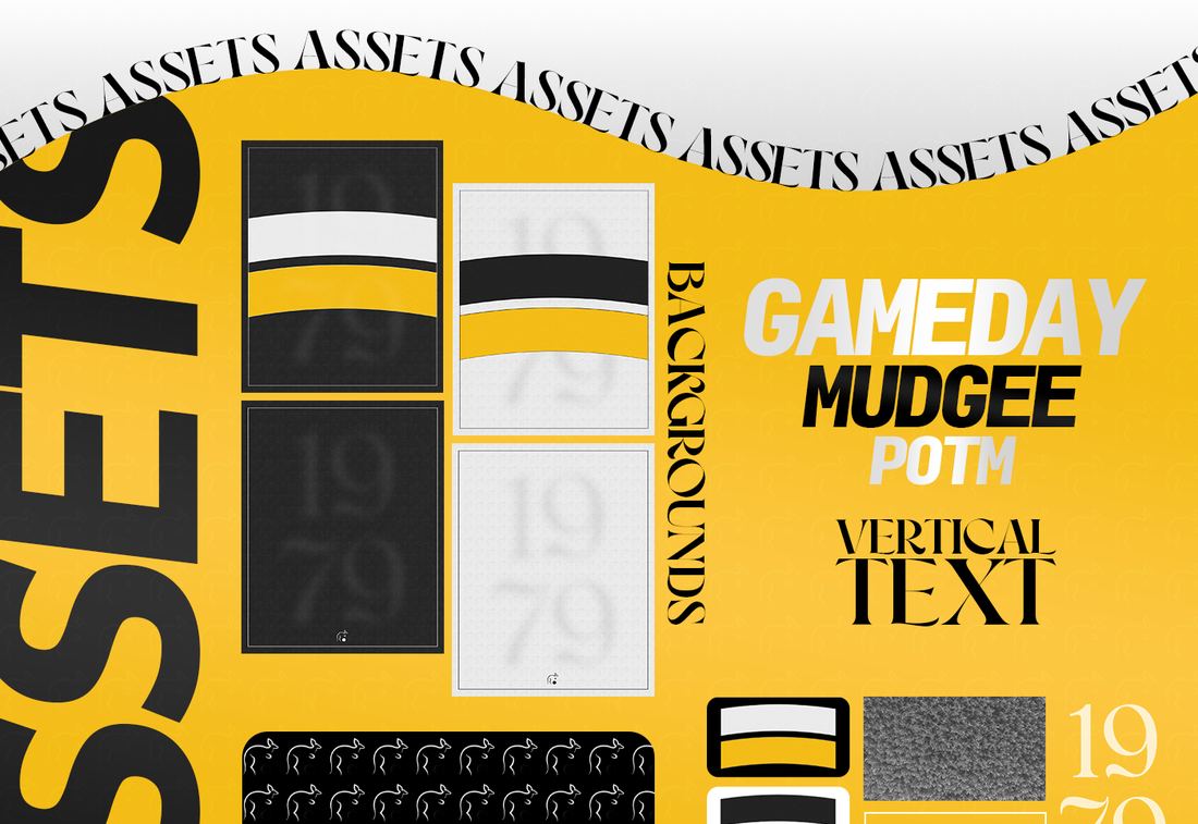
The eleven formats side by side. The point of the set is that none of them look like a different club. -
03
One skeleton underneath all of them
Every format is drawn on the same grid. Same safe margins, same crest position, same sponsor strip along the bottom, same name plate, same treatment on the photograph behind it. Once that skeleton exists, a new format is a variation rather than a new design.
The colours and type come from the club, not from me. I work to the crest that already exists — the palette is pulled off it, and the typography is chosen to sit with it rather than compete. A rebrand that makes a club look like my portfolio instead of like themselves has failed.
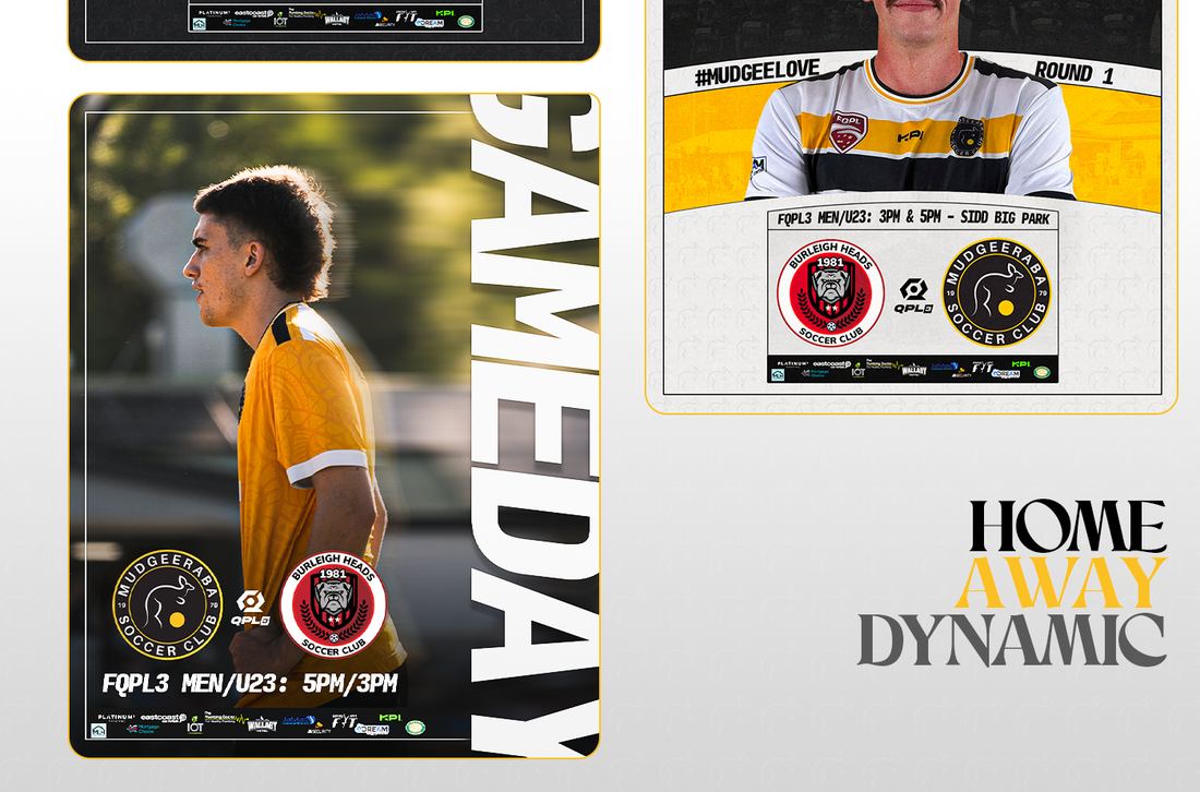
Matchday. Opponent, time and venue are text layers; the photograph is a smart object you drag a new image into. -
04
Locking the design, unlocking the content
Everything ships as layered Photoshop files. The design is locked — positions, sizes, colours, effects. What is left open is the part that changes every week: names, scores, times, photographs and sponsors.
Photographs go into smart objects, so a new image drops in already masked and already sized. Text layers are named in plain English rather than Layer 14 copy, because the person opening the file next season did not build it and should not have to work out what anything is.
That is the whole difference. Somebody updating a template is not designing a poster. It takes them four minutes and it comes out consistent whether they have a design background or not.
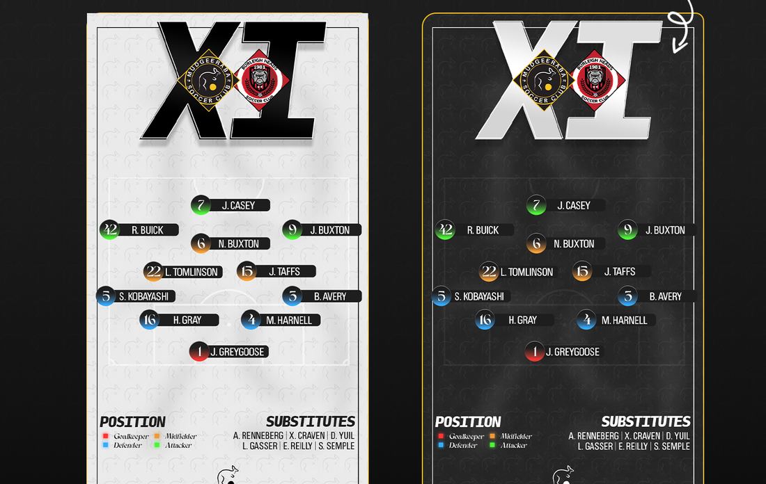
Starting eleven. Eleven text layers and eleven cut-outs, all pre-positioned. -
05
Handing it over so it survives the handover
Most clubs I work with are volunteer-run, and the person running the account changes. A system that stops working the moment its owner steps down is not much of a system.
So the handover is part of the job: a walkthrough of the files, the fonts supplied, and the sources included. On final payment the files are the club's, editable, with nothing to renew and no subscription holding them hostage. If a new format is needed mid-season, that is quoted as new work — not a reason the rest stops.
What the club ended up with
- Eleven formats running off one grid, in the club's own colours and crest.
- Posts made by the committee in minutes, without a designer in the loop.
- Layered sources handed over on final payment — no subscription, nothing to renew.
- A feed that reads as one club instead of eleven people with a phone.