-
01
A different kind of job to a template set
Template work is about the fiftieth post being as good as the first. This was the opposite problem. One announcement, going out once, to an audience much larger than the club's usual reach, with people seeing the club for the first time because of it.
There is no averaging out over a season. The graphic either lands in the first second of somebody's scroll or the news quietly does not travel.
-
02
Deciding the one thing it had to say
The brief arrived the way most club briefs do — with everything in it. The news, the date, the venue, the ticketing, the partners, the hashtags. All of it true, all of it wanting to be on the graphic.
So the first piece of work was subtraction. I picked the single fact that made this worth announcing and gave it the whole composition. Everything else got demoted to a size that is legible when you stop, and invisible when you don't. A post that says one thing loudly gets read. A post that says six things equally gets scrolled.
-
03
Building it around the photograph
The image had to carry the emotion, so the layout was drawn around it rather than the other way round. Cut out, re-lit so the subject separates from the background, and positioned so the type has somewhere clean to sit without a box behind it.
The club's colours do the framing. Nothing in the composition is a stock treatment — it is the crest palette pushed to its high-contrast end, because an announcement should look like an occasion and still look like the club.
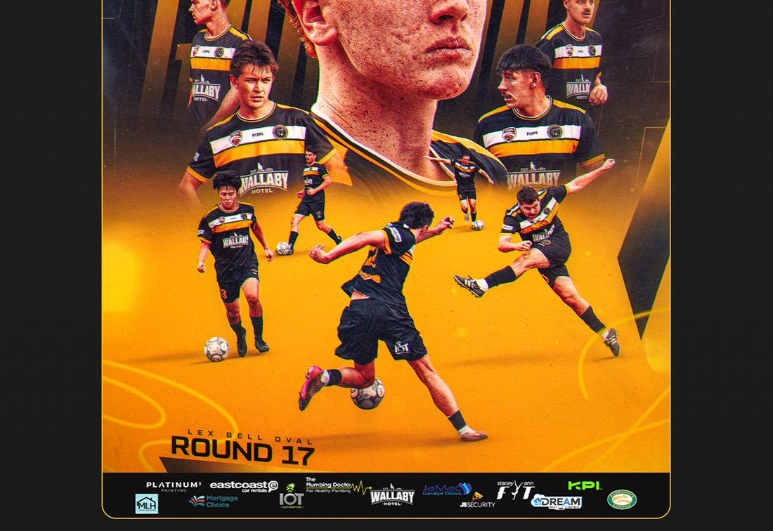
The announcement as it went out. One fact at full size; everything else is deliberately quiet. -
04
Type that survives a thumbnail
Almost nobody sees a post at full size first. They see it as a thumbnail in a grid, or a rectangle a third of the screen wide while their thumb is already moving.
So the headline was tested at that size before anything else was refined. If it is not readable small, it is not readable — no amount of detail at full resolution fixes it. Weight went up, tracking tightened, and the line broke where the sentence breaks rather than where the box ends.
-
05
Sized for where it actually gets seen
It went out as a 4:5 feed post and a 9:16 story, both built from the same file rather than one squashed into the other. The story version is not a crop — the composition is rebuilt for the taller frame so nothing important sits under the profile bubble or the reply bar.
Both were exported at the resolution the platform actually wants, so the compression does not eat the edges of the type. It is a small thing that is very visible when it is skipped.
What the club ended up with
- The club's largest promotional announcement carried by one graphic, not a caption.
- Feed and story versions composed separately from one source file.
- Headline tested at thumbnail size before anything else was finished.
- Built in the club's own palette — an occasion that still looks like Broadbeach.