-
01
Why redraw something that already works
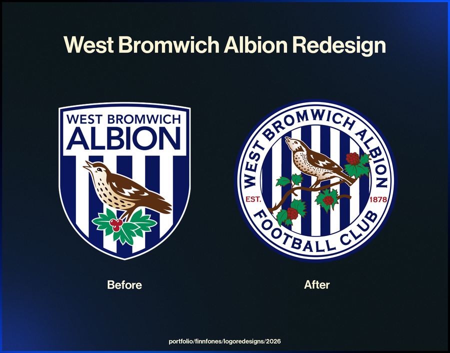
Older club crests were drawn for embroidery and print, not for a 40-pixel circle on a phone. They carry detail that reads beautifully on a shirt and turns to mush in a feed.
So this was a legibility exercise, not a rebrand. The question was what the mark needs to keep to still be unmistakably itself, and what it can lose without anybody noticing.
-
02
Rebuilding it on a grid
Every curve was redrawn against a construction grid rather than traced. That means consistent stroke weights, repeating radii, and shapes that hold together when the whole thing is scaled down.
The test throughout was the small size. If a detail disappeared at 40 pixels, it either got simplified until it survived or removed so it was not adding noise.
-
03
What it is and is not
This is a personal study. It is not affiliated with, endorsed by, or produced for West Bromwich Albion, and it has never been used by the club.
It sits here because the thinking behind it is the same thinking that goes into client work: a mark has to survive being small, being on a photograph, and being reproduced by people who are not designers.
What the club ended up with
- A single-colour mark that stays readable at profile-picture size.
- Consistent stroke weights and repeating radii, drawn rather than traced.
- A self-directed study, unaffiliated with the club.