-
01
The cut-out is the whole job
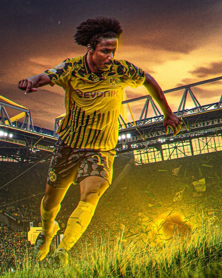
Ninety per cent of the time on a poster like this goes into the cut-out. Hair, the gap between an arm and a body, the edge of a sleeve against a similar-coloured background — that is where a graphic either looks made or looks pasted.
The rest of the composition is comparatively quick. If the subject sits properly in the frame, the type and the colour almost place themselves.
-
02
Relighting so the subject belongs
A cut-out dropped onto a new background almost never matches it. The light is coming from the wrong side, the colour temperature is off, and the eye reads it as wrong before it can say why.
So the subject gets relit to the background rather than the other way round: a rim light on the side the new light comes from, shadow reintroduced underneath, and the colour graded until they agree.
-
03
Type that stays out of the way
The name is the only text that matters, so it gets size and nothing competes with it. Everything else — number, position, fixture — sits small and out of the subject's way.
Working at this size is also how the type scale for a club set gets decided. What survives here at poster size is what goes into the template as a locked layer.
-
04
Why it is in the portfolio
Every treatment in this series ends up simplified into something repeatable. A club does not want a poster that takes four hours; they want the look of one in four minutes.
So the series is the research and the template set is the product. This is where the two meet.
What the club ended up with
- A cut-out and relighting method that works on inconsistent club photography.
- A type scale proven at poster size before it goes into a template.
- Treatments that get simplified into something a volunteer can repeat.