-
01
Choosing the frame
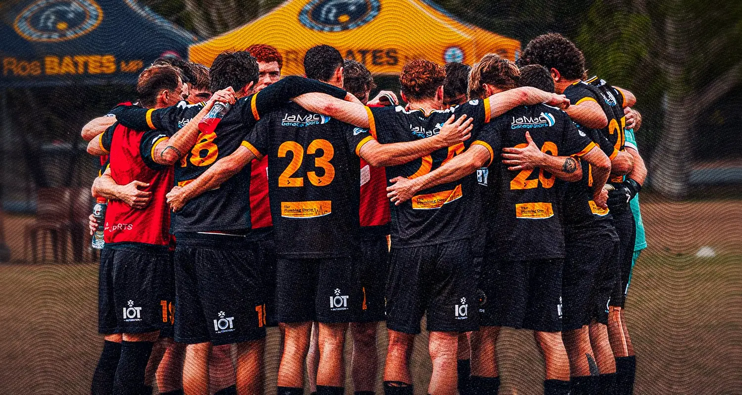
A grand final produces hundreds of photographs and most of them are action. The one that carries a poster is usually not the goal — it is the moment either side of it, where you can see what it meant.
A huddle works because it is legible as a shape at thumbnail size and it reads as a team rather than an individual, which is what a final is about.
-
02
Holding type over a busy photograph
A crowded image fights every word you put on it. The usual fixes — a box, a heavy scrim over the whole frame — flatten the photograph and waste the reason you chose it.
Instead the gradient is shaped to the composition, dark only where the type sits and clearing where the subject is. The photograph keeps its contrast and the words still read.
-
03
Earning the difference
A premium treatment only means something if the ordinary weeks look ordinary. If every graphic is maximal, the final has nowhere to go.
That is why the big-game tier exists in the template sets as a separate format. It is held back on purpose so that when it appears, the feed itself tells you the match matters.
What the club ended up with
- A single photograph carrying the whole composition.
- Type held legible over a busy frame without flattening it.
- A treatment held back so the difference is visible when it appears.